How we improved accessibility by 42%
23 Nov 2018
...and how you can too!
We've just spent several days improving the accessibility of the Downtime Monkey website. Last week we carried out an audit of the site with Google's new tool web.dev, which is currently in beta.
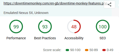
The tool returned high scores for three of the four aspects that were tested: performance (i.e. website speed), best practices and SEO (i.e. optimisation for search engines).
This was no surprise as we'd focused heavily on best practice and SEO when developing the site and in January we undertook a very thorough performance audit where we reduced page load time by more than half.
However, the accessibility score was just 48%, so there was plenty of room for improvement.
Here are the scores before:
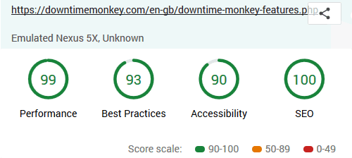
...and after the accessibility improvements were completed:
Side note: all of the pages with embedded YouTube videos showed reduced performance scores. This has previously been covered in-depth in this post on improving page speed.
What Is Accessibility?
From Wikipedia:
"Web accessibility is the inclusive practice of ensuring there are no barriers that prevent interaction with, or access to websites, by people with disabilities. When sites are correctly designed, developed and edited, generally all users have equal access to information and functionality."
In practice, this (mostly!) means ensuring that screen-reader software can access and interact with all the content that is in place on a website.
Why Improve Accessibility?
The web is possibly the modern world's greatest tool and good accessibility means that more people have access to this brilliant tool and all the benefits that come from it.
But that is not the only reason to improve accessibility...
If your website is inaccessible you are losing some users, which means that you are losing customers.
Improving accessibility is very straightforward, and we've provided full details of the optimisations that we made so that you can apply them to your own website.
Step 1: Run A Test
Our starting point was a website that had already been developed with accessibility in mind but had never been thoroughly tested.
Testing with web.dev is easy. Simply input the URL of the webpage that you want to test and hit 'run audit'.
The results include an overall score and a list of recommendations for each of the 4 categories. Here we're only concerned with the accessibility category.
Step 2: Act On The Recommendations
Following the recommendations is straightforward but it is time consuming as every page on a website must be tested and corrected individually.
This is because improving accessibility is about making all content visible to screen-readers.
It is easy to forget to add an 'alt tag' to an image or an 'input label' to a form field, and a few omissions can drastically reduce the accessibility of your website.
Here are some improvements that are easily made:
Alt Tags For Images
The error: "Image elements do not have [alt] attributes".
All images must have an 'alt tag' in place. This should consist of a few words that describe the picture so that a screen-reader can read out a description of the image.
For example:
<img src="images/blue-bird.jpg" alt="blue bird in forest">
Labels For Input Fields
The error: "Form elements do not have associated labels".
Most input fields should have an associated 'label' so that screen-readers can read out a description of the input field, letting the user know what to input into the field.
Note that labels are not required for hidden inputs, buttons or 'submit' inputs.
The common inputs that require input labels are:
<input type="text">
<input type="password">
<textarea>
<input type="radio">
<input type="checkbox">
<select>
<input type="tel">
It is best to apply the label 'explicitly', as in the following example. Note that the 'for' attribute should match the 'id' of the input:
<label for="name">Name</label>
<input type="text" id="name" value="">
Invisible Labels For Self-Explanatory Input Fields
The error: "Form elements do not have associated labels".
Sometimes an input field is self-explanatory for sighted users. One example from Downtime Monkey is the 'select your country' dropdown menu - it's obvious from the design of the site that the user needs to select their country. Adding a visible label here would actually decrease user experience.
But screen-readers can't read the design of the site!
The solution is to add a label that is visible to screen-readers but not shown on-screen. This is best done by creating a CSS class for 'screen-readers-only' and applying that to the label.
Here is the HTML:
<label for="add_country" class="screen-reader-only">Select Your Country</label>
<select id="add_country" name="add_country" onchange="this.form.submit()">
	<option class="country-placeholder" selected disabled> -- Select your country -- </option>
	<option class="country-option" value="1">Country 1</option>
	<option class="country-option" value="1">Country 1</option>
</select>
When creating the CSS class it is important not to use 'display: none' or 'visibility: hidden' because screen-readers skip content that is hidden like this.
Instead we positioned the content off-screen. This is the CSS:
.screen-readers-only {
	position: absolute !important;
	top: -1000px !important;
	left: -1000px !important;
}
Aria Labels For Image Links
The error: "Links do not have a discernible name".
Sometimes images are used as links - a common example is a logo that links to the home page of a website.
This poses a problem for screen-reader users as they cannot see the image and no text is in place.
The solution is to add an 'Aria Label' which describes the landing page:
<a aria-label="Home" href="index.php">
	<img src="images/downtime-monkey-logo-white.png" alt="downtime monkey logo">
</a>
Titles For iframes
The error: "frame or iframe elements do not have a title".
The cause of this error was embedded YouTube videos and it was something that we had missed completely.
Embed code supplied by a YouTube video comes without a title. Unfortunately this means that screen-reader users can't tell what the video is about or even that the iframe contains a video!
This can be rectified by adding a 'title' to the iframe:
<iframe src="https://www.youtube.com/embed/-SyWKnrECsc?ecver=1" frameborder="0" gesture="media" allowfullscreen title="Video on how to monitor a website"></iframe>
Allow Users To Scale The Webpage
The error: "user-scalable='no' is used in the meta name='viewport' element or the maximum-scale attribute is less than 5".
We have spent a lot of time ensuring that the website worked well across all screen-sizes from tiny phones to large widescreens. Part of this was making sure that the text is sized appropriately for the screen that it is shown on.
So it was really annoying when some phones (we're looking at you iphone!) override this, apply their own zoom and muck-up the beautiful text sizing!
To prevent this we had used 'user-scalable=no' so that the correct text sizes were seen on iphones.
Unfortunately a side-effect of this was that everyone was prevented from zooming - so partially-sited users who need larger text would be unable to zoom.
This was easily fixed by removing 'user-scalable=no' from the meta viewport (iphone users will just have to live with slightly less perfect text sizing!):
<meta name="viewport" content="width=device-width, initial-scale=1.0">
Aria Labels For Icon Forms
The error: "Form elements do not have associated labels".
Sometimes when an icon is clicked a form is submitted. A common example is when a 'trash icon' is used to submit a form which deletes something.
This makes for a great user-experience for sighted users but there's no text present for a screen-reader to read.
The solution is to add an 'Aria Label' which describes what happens when the icon is selected. Note that in the following example
the 'trash icon' is a Font Awesome icon which is supplied by its Unicode value 
<input type="submit" value="" name="delete" class="fa blue" title="delete monitor" aria-label="delete monitor">
Aria Labels For Icons That Show Important Information
In this case there is no error from web.dev because icons only need to be labelled under certain circumstances.
When an icon is present purely to add style there is no need to add a label. For example, on Downtime Monkey when a user's list of monitors is displayed, every website that is up has a tick icon shown beside the word "UP". No extra information is provided by the icon so there is no need for a label.
However, when an icon provides additional information it is important to use an 'Aria Label' so that a screen-reader can provide the information to its user.
An example, again from the user's list of website monitors, is that the bell icon is shown when email alerts for a specific monitor are turned 'on' and the bell-slash icon is shown when email alerts are turned 'off'.
Here's the code for when a monitor has alerts turned on - again, Font Awesome was used for the icon:
<a title="email alerts on" aria-label="email alerts on" class="blue no-underline">email: <i class="fa fa-bell"></i></a>
Aria Labels For Icon Links
The error: "Links do not have a discernible name".
Sometimes an icon is used as a link. For example, a PDF icon is linked to a receipt document in a user's 'order history' so they can easily view and print their order details.
However, screen-readers need text to provide the context of the link.
Again, adding an 'Aria Label' to the link solves this problem.
<a href="invoice-pdfs/325.pdf" aria-label="Receipt 325"><i class="fa fa-file-pdf-o"></i></a>
Button Roles & Aria Labels for Linked Spans
In this case no error was caught by web.dev, however accessibility improvements were made.
In Downtime Monkey, modals are used as an alternative to dropdown menus because they provide better user experience.
The image below shows the modal that is used to display the 'user menu'.
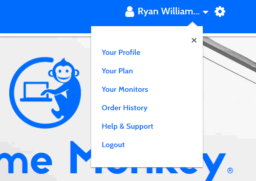
Note that in the top right corner of the modal there is an 'x' which can be clicked on to close the modal.
This x is a span that acts as a button and this is potentially confusing for screen-reader users as it doesn't provide context for the link.
The solution is to add a 'role' to the link to tell screen-readers that it acts as a 'button' and also to add an 'Aria Label' to describe what the button does:
<span id="settings-close" role="button" aria-label="close menu" class="modal-close">×</span>
High Colour Contrast - Not Implemented
The error: "Background and foreground colors do not have a sufficient contrast ratio".
Low-contrast text can be difficult to read for partially sited users and high-contrast text is recommended to make text easier to read for everyone.
Most of the text on the site passed, but some blue, green and orange text failed.
However, implementing new colours is a big job. Simply upping the contrast of the current colours considerably reduced the user experience for most people. The high contrast text was either really bright (so bright that it hurt) or very dark (dark enough that it made it hard to distinguish between small headings and paragraph text).
It became evident that introducing high-contrast colours would involve redesigning the site. We thought long and hard about this and in the end it was decided that the benefits of keeping the colour scheme outweighed the disadvantages, although we may revisit this in the future when we have more time to spend on redesign.
Step 3: Re-run The Test
Running the test after making the changes provides a check to ensure that fixes have been applied correctly.
You should also see the accessibility score improve and congratulate yourself on a job well done :)
All Posts
Website Monitoring Prices Compared
Scheduled Maintenance 17th June 2021
US Text Alerts Updated For 10DLC
A Quick Study Of Response Time
'Early-bird' Discount Ends November
Downtime Logs... All In One Place
The Effects Of COVID-19 Lockdowns
Lockdown Bugfixes & Midnight Coding
Monitoring URLs With Query Strings
New Pro Plans For EU Individuals
Free & Pro Monitoring Compared
Downtime Alerts: An Ideal Custom Setup
Server Upgrade & IP Address Change
Website Monitoring: Cheap vs Free
Website Content (Keyword) Monitoring
Cheap Website Monitoring Pro Plans
Server Upgrade Scheduled Completed
Whitelist Email Addresses in cPanel
Website Downtime Alerts To Slack
Whitelist Email Addresses: Thunderbird
Whitelist Email Addresses in Yahoo Mail
How we improved accessibility by 42%
Whitelist Email Addresses in Outlook
Whitelist Email Addresses In Gmail
Why Whitelist An Email Address?
When is a website considered down
Bulk import, edit and delete monitors
Privacy, democracy & bureaucracy
How Much Downtime is Acceptable?
Server Upgrade Scheduled Completed
Free Plan Upgraded to 60 Monitors
New Feature: Rate Limit SMS Alerts
How We Boosted Page Speed By 58%
How To Reduce Website Downtime